


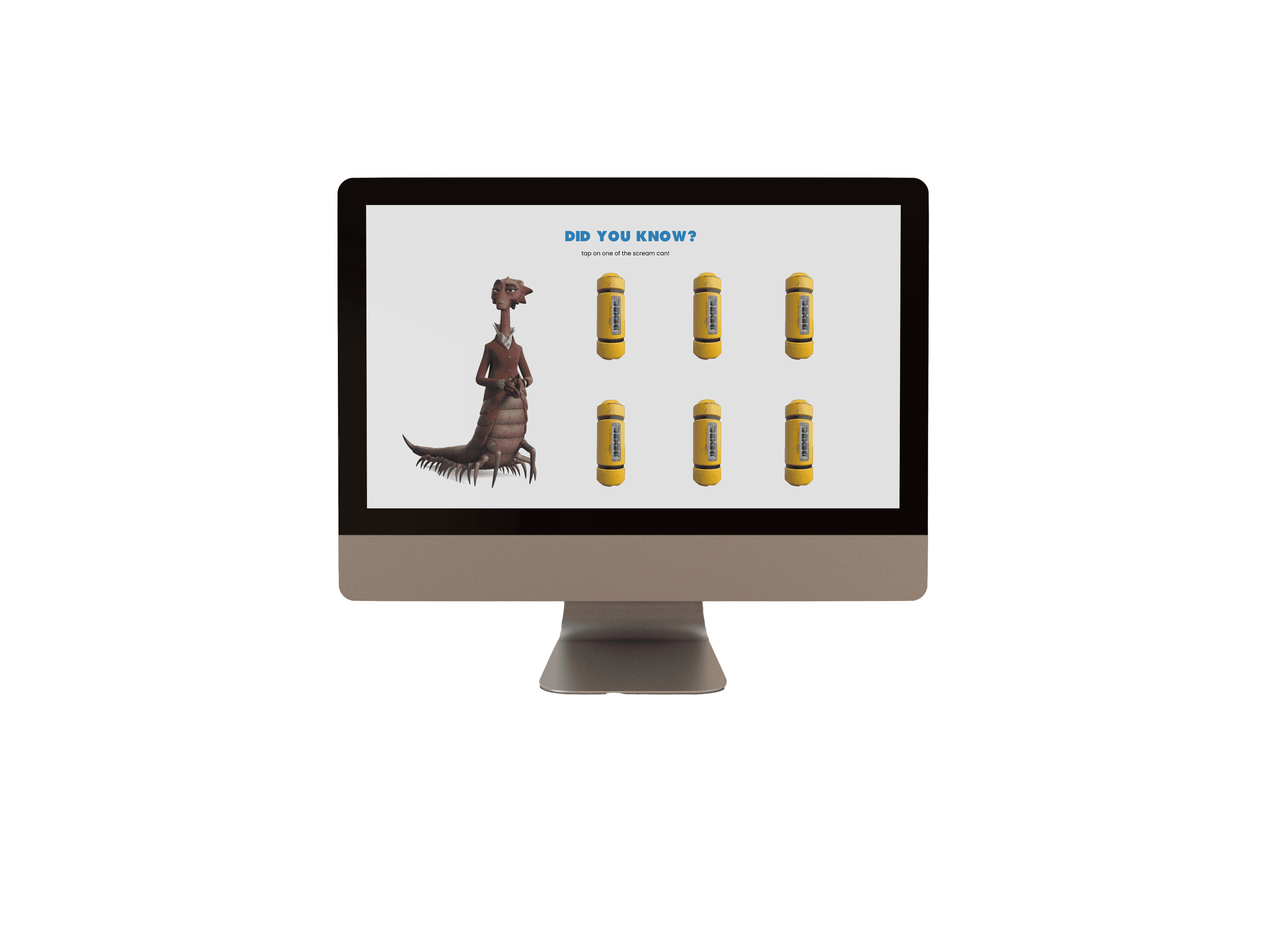


Learnability
The way to a perfect watching experience in a click of a button. We provide an explanation to each option and make sure that the process of buying a ticket is short and easy.
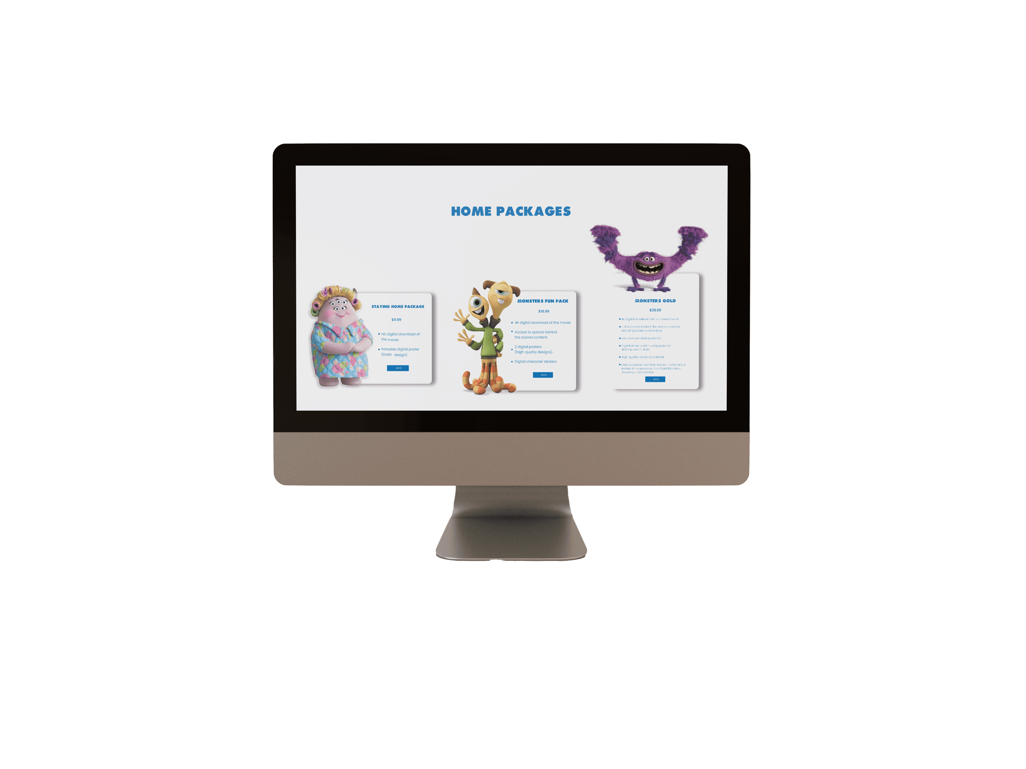
Efficiency
Instead of waiting in line at the cinema or finding out that the tickets are sold out, we make it possible to enjoy an unforgettable watching experience at a prestigious event or from home with three bundles, suitable for everyone.
Design
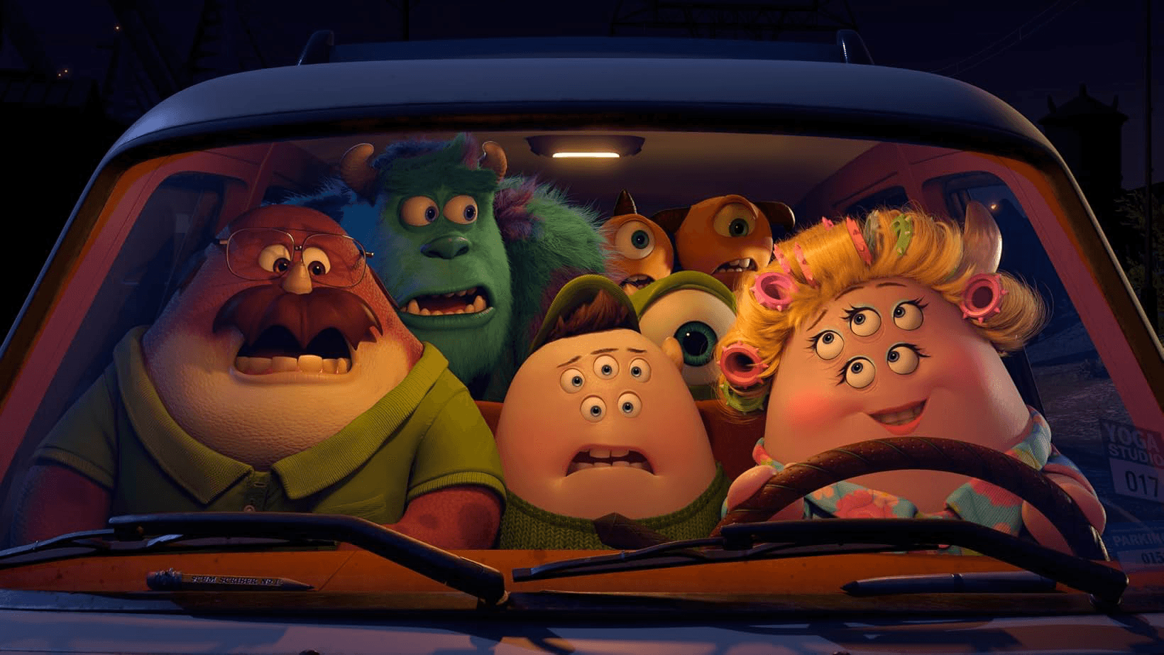
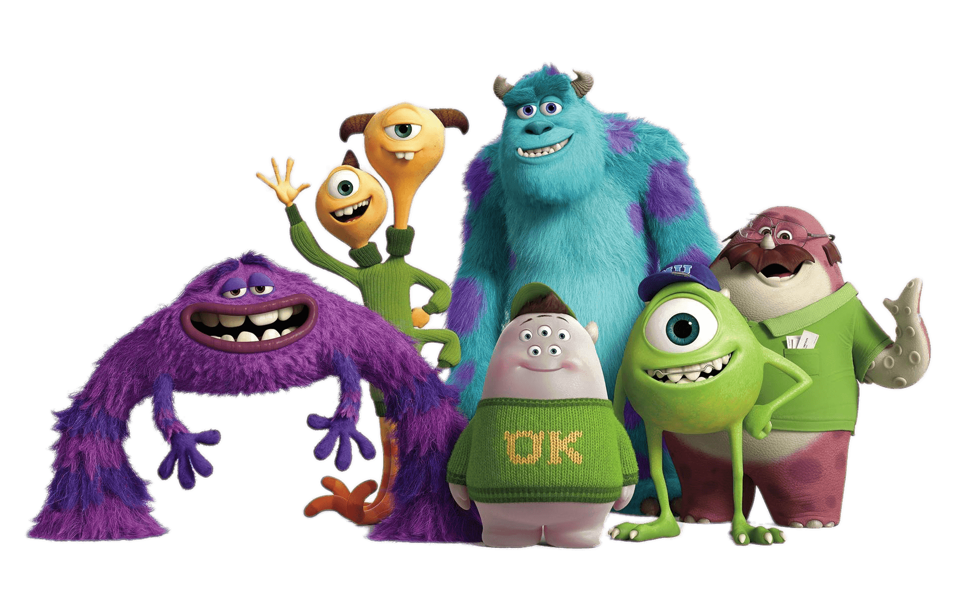
We selected a design that harmonizes with the film, carefully matching its characters and color palette. The chosen colors are visually pleasing and create an overall aesthetic that complements the movie's tone and enhances the viewing experience.
Memorability
The site's colors are taken from the posters of the movie which makes it more eye catching for users who have already watched it. For new viewers, we make sure to be consistent with our colors usage for different elements.
Aging Film: Released in 2013, it may feel outdated compared to newer, more advanced films.
Seen as a "Sequel": Some viewers may dismiss it as just a prequel to Monsters, Inc., lacking its own standalone value.
Shifting Viewing Habits: With the rise of streaming and quick content, longer animated films may struggle against faster-paced series and movies.
New Audience, New Preferences: Younger viewers might not feel nostalgic or connected to the original film’s world and themes.
Oversaturation of Animation: Audiences could feel overwhelmed by the sheer number of animated films and may overlook it.